A week or so back, I brought you my a piece on the 25 coolest Brewers card of all-time out of my sports-writing archive. Now, as promised, is the other end of that stick… the ugly end. I’ve widened my scope here from the original list, including off-brands and team-issued cards in the hunt, which so often produce the weird and ugly cards that make the hobby fun. And, to limit my own mental suffering, I’ve kept this list to 20 slots. On we go…
#20. 2004 Topps Brewers Team

Hey, team cards are way cool, right? So what’s the problem here? Well, aside from the framing of the card leaving the players’ head roughly the size of Dippin’ Dots pellets (THE ICE CREAM OF THE FUTURE!), there is that odd Brewers-branded fence running in front of the team. What’s the deal here? Is the coaching staff all hangin’ brain? No, this was a lame device used by Topps to cover the faces of the batboys sitting in front of the first row, and thus preventing from owning them any possible royalties for using their likenesses. Fun!
#19. 1992 Leaf Studio Bill Wegman

Leaf’s Studio series was actually a pretty cool idea: combine casual portrait shots of players in uniform with fun personal facts on the back! Wee! Being the early 1990s, however, we are left with an inordinate number of high school senior portrait-looking images like this one of Billy Wegman. According to the back, his favorite movie is Misery. It does not mention which one of his parents cuts his hair.
#18. 2010 Topps Corey Hart
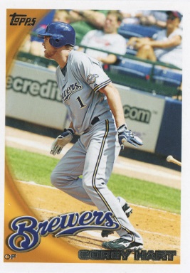
Nothing wrong with this card… except that the picture is crooked as hell. What gives? His pose even gives the impression he is about to run uphill. And the bat at the edge of the photo looks like its has fallen out of his hand. I mean, Corey Hart sometimes played the outfield like he was running uphill, but this is nuts.
#17 (tie). 2008 Topps Bill Hall, 2015 Topps Archives Khris Davis
Hey fans, meet Bill Hall and Khris Davis! Although, you might know them better as Rickie Weeks and Carlos Gomez.
#16. 1980 Topps Paul Mitchell

Who didn’t spend hours as a kids drawing team logos in their school notebooks? Obviously, the boob who painted that deformed ball and glove logo on Mitchell’s big blue cap. The Brewers had acquired the pitcher half-way through the 1979 season and the folks at Topps didn’t have time to find a picture of his in a Brewers uni for the 1980 set, so this airbrushed logo is what collectors got. He fared better than Bob Fenwick, anyway.
#15. 2009 Brewers Police Todd Coffey
There are not many Brewers cards out there of Todd Coffey and, like all the Brewers police-issue cards, it has a special “quote” from the player on the back to kids. But how could they give Coffey a quote that LIED ABOUT THE ONE THING HE BEST KNOWN FOR? It’s like a Ryan Braun police card telling kids not to design their own line of t-shirts!
#14. 1987 Topps John Henry Johnson

Trivia time: Which one of the Sweathogs does he most resemble? I’d give the answer, but I can’t figure it out myself.
#13. 1996 Bowman Josh Bishop

Bowman was always a cool set to collect because they issues a zillion minor league guys with the regular Major Leaguers, meaning you got to collect the rookies of players several years before they made it big. It also meant you stuck with stacks of guys like Josh Bishop, middling prospects who never made it big and had their moments of cardboard glory while sporting bad facial hair and Butthead mouths.
#12. 1981 Topps Pete Vuckovich

Teammate: Ugh. Who farted?!?
Vuckovich: You know who…
#11. 2007 Topps Ben Sheets

Yikes. Sheets looks like a kid being forced to pose in prom tuxedo by his parents. I mean, they couldn’t have tried any harder to get a decent shot of Big Ben? If you put a newspaper in hand, this could be a kidnapping “proof of life” photo. The text on the back should just say, “Ben Sheets exists.”
#10. 1982 Topps Rollie Fingers “In Action”

Topps used to issue these “In Action” cards back when most card photos were posed headshots, the idea being to give collectors a chance to see game photos of players. But this is action? He’s standing for crissakes! Unless you’ve been bedridden for five or more days, that is not action. Extra points, too, for Rollie’s rear end, which manages to be both flat and lumpy at one time.
#9. 1999 Skybox Thunder Marquis Grissom

A kind of cult-favorite among collectors, this set features reverse text written in a very unfortunate quasi-hip-hop prose. Of Grissom, the card states, “Our boy Grissom be runnin’ so fast, y’all might just miss ‘em! Man, you got more jets than the Air Force!” This set proves that rapping should be left to the professionals and elderly white women.
#8. 1992 Fleer Mark Lee

If this guy had a mustache, he’d be every one of my uncles in their prime. Anyone who tells you that baseball players aren’t athletes has probably seen this photo.
#7. 1996 Topps Finest David Hulse

The words “Finest” and “David Hulse” just don’t quite fit together. Furthermore, the design of this “super-premium” card feels like something out of Tron. Hulse actually batted .286 the year before this card was issued. Not bad for someone with the build of Mr. Burns.
#6. 2009 Topps Jeff Suppan
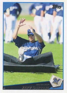
So, it’s like, a recreation of the final scene in A Clockwork Orange, only with Jeff Suppan and a gym mat instead of Malcolm McDowell and the naked woman? Which would make McDowell the gym mat and… Damn you, Topps.
#5. 1991 Leaf Studio Ron Robinson

Whoa! Those are some serious bedroom eyes for a baseball card. Another entry in the Studio series, this one reveals another flaw in the whole concept – that it tried to make these guys look waaaay too sexy. On the back, it reveals that Robinson likes rock music, Married, With Children, and collecting baseball cards. They should have called this the OkCupid set. Our match percentage would have been pretty high.
#4. 1994 Fleer Matt Mieske
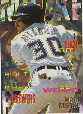
1994 Fleer is sooooo grunge ‘90s, it ought to have a stat category in the back for number of nipples pierced. The set’s most X-Treme gimmick was put the player’s bio info on the FRONT! I bet Kennedy collected these. Anyway, this horrifying contept leaves us with cards like this… with Matt Mieske’s weight plastered across his ass.
#3. 1995 Pinnacle Antone Williamson

No, that’s not a young Wes Helms, nor is it a Division 2-A college softball player, a Sears activewear model, or a pioneer of Dadbod. That’s Antone Williamson, drafted fourth overall by the Brewers in 1994 – over Nomar Garciaparra, Paul Konerko, and Jason Varitek. Williamson totaled 11 hits in 24 career games with the Brewers. In 2012, the spotting of a Williamson jersey at Miller Park was such a shock it inspired an entire blog post at fangraphs.com.
#2. 1971 Topps Dave Baldwin
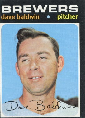
Alfalfa is grown up, very drunk, and about to make an incredibly sexually suggestive remark to a complete stranger.
#1. 1992 Bowman Chris George

1992 Bowman is one of the all-time baseball card sets. The abundance of rookie and its low print run make it a classic, featuring debut cards of Manny Ramirez, Mariano Rivera, Mike Piazza, Trevor Hoffman, and Carlos Delgado. But being a pioneer in the “pre-rookie” card business, Bowman sometimes had to get “creative” with their picture, as many players featured had not yet appeared in major league games. Opting against minor league action photos, collectors got a plethora of weird photos staged in early 90’s semi-casual clothing with a vague baseball theme. So, this is how we get the rookie card of lefty Chris George, who pitched all of six major league innings, looking either like a candidate for Ozaukee County treasurer or an TV commercial actor about to tell you about how he cured his “low T.” So, if you ever imagined you lived in world without a baseball card featuring a player in wearing a denim shirt, wristwatch, and woven leather loafers, you need to find something else to believe in.


